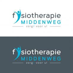
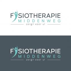
Design an original company logo and branding for a new physical therapy practice.

Start date: 08-04-2016

Ending date: 22-04-2016

Total budget: € 419.00
WINNER
Book cover
VirtualLies

It all started with an idea...

A short, interactive guide helped them discover their design style and clearly captured what they needed.

Needs


I need a powerful logo for my new practice in fysiotherapy in Amsterdam, the Netherlands. Key words are prevention, health, personal care, 'be fit and stay fit' and rehabilitation.

The logo will be used in window film and all other communication means.

Company description


Practice in physical therapy, modern and luxurious interior. Located at the Middenweg, across from historical Park Frankendael, in the suburb Watergraafsmeer in Amsterdam.

Besides being an 'allround physical therapist', my practice is a knowledge and expert centre in the treatment of (chronical) neck and shoulder problems. Additional ultrasound assessment is an extra diagnostic tool of great value. Patients can also rehabilitate after (sports) injuries and surgeries. Another important aspect is a health prevention program: 'get fit, stay fit', for which I provide personal training, (sports) massages and running training. I like an active approach. Recovery of injuries is an active process, that requires work and practice from my patients.

Target group


I focuss on patients between 25 and 65 years of age. But of course older patients who are recovering from injury or surgery are welcome too.

Colors, favourites and other requirements


Logo should not be too (fitness) sports focussed.

Colors of preference: blue, green, white and/or black (Farrow and Ball nr. 85 is a color I like)

Company name: Fysiotherapie Middenweg (large font)

Slogan: zorgt voor u! (small font, letter t italic)

Designer: VirtualLies VirtualLies
logo_corporate_design-virtuallies-lIlJ2rGC

No comments

This contest is finished. Its not possible to reply anymore.
logo_corporate_design-virtuallies-mTtiMVbU

No comments

This contest is finished. Its not possible to reply anymore.
logo_corporate_design-virtuallies-FhHtZxlw

No comments

This contest is finished. Its not possible to reply anymore.
logo_corporate_design-virtuallies-3HQPCJX6

No comments

This contest is finished. Its not possible to reply anymore.
logo_corporate_design-virtuallies-dudG4ILY

VirtualLiesVirtualLies

Hi Erik,
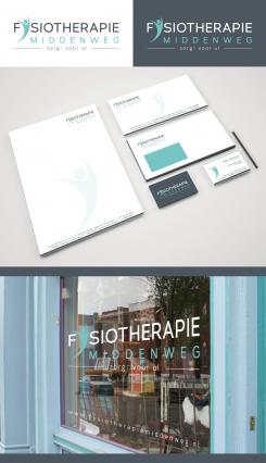
attached a first layout for an according housestyle including the window view requested. looking forward to hear your opinion, kind regards, Dagmar

This contest is finished. Its not possible to reply anymore.
logo_corporate_design-virtuallies-unPVLFtA

No comments

This contest is finished. Its not possible to reply anymore.
logo_corporate_design-virtuallies-EW5anDua

VirtualLiesVirtualLies

Good morning Erik V,
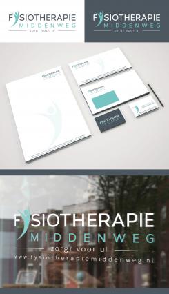
thank you very much for your kind feedback and your positive rating ;) Attached a first revision with the requested changes. Please let me know, if there's anything else you like to improve, kind regards, Dagmar Lange

Erik VErik V

Hi Dagmar, thanks for this new version. I like the previous version better, the capital letters work better somehow in your logo. I also like the softer green colour better than this blue colour. There is one thing I would like to change in the previouw logo: can you give the italic t in 'zorgt voor u' the green colour as well? Thanks!

This contest is finished. Its not possible to reply anymore.
logo_corporate_design-virtuallies-W1BYs3uK

No comments

Erik VErik V

Bedankt voor het mooie logo!

Erik VErik V

De 't'van zorgt moet opvallen. Deze slogan moet namelijk op 2 manieren gelezen kunnen worden.

Erik VErik V

Ik zou het woord 'fysiotherapie' nog eens in kleine letters zien. Alvast bedankt!

This contest is finished. Its not possible to reply anymore.