Good morning ;),
attached the layout with the new slogan,
kind regards, Dagmar
Develop a logo and housestyle for www.warmtepomp.expert
- Contest holder: bartvdh
- Category: Logo & stationery
- Status: Ended
- Files: File 1
Start date: 26-07-2016
Ending date: 09-08-2016
It all started with an idea...
A short, interactive guide helped them discover their design style and clearly captured what they needed.
Brandsupply is a platform where creative professionals and businesses collaborate on unique projects and designs.
Clients looking for a new logo or brand identity describe what they need. Designers can then participate in the project via Brandsupply by submitting one or more designs. In the end, the client chooses the design they like best.
Costs vary depending on the type of project — from €169 for a business or project name to €539 for a complete website. The client decides how much they want to pay for the entire project.
Great Dagmar, many thanks. Can you when the contest ends (and after we appointed you as our winner) deliver us the logo design in EPS, JPG format (and maybe other high quality file formats which are commonly used)? Would you be able to provide us with a Word and Powerpoint (first page only) template, as per your design? Do let us know as well how we can obtain the font(s) you used. Many thanks again, Bart
Good morning Bart,
attached you find a new version based on your yesterday's feedback ;) Hopr this is the direction you were looking for... If you like to see additional changes, please let me know,
kind regards, Dagmar
Hi Dagmar, many thanks for the redesign. Exactly what we were looking for. We'd like to change the slogan/tag-line to 'duurzame warmte is een keuze'. We think it's great, many thanks! Bart
Hi Dagmar, many thanks for the redesign. Exactly what we were looking for. We'd like to change the slogan/tag-line to 'duurzame warmte is een keuze'. We think it's great, many thanks! Bart
Hi Bart,
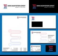
attached a new version with the requested changes as well as a first layout for a housestyle design. Curious to know, if you like this better,
best regards, Dagmar
Hi Dagmar, we like the logo, is the font a standard font (we can buy somewhere) so we could use it for other purposes as well?
Hi Bart,
thank you for your rating ;) Both font styles used are free fonts, so you could just download and use them. If you should select my design at the end of the contest, I will send you the links where you can find them ;)
Kind regards, Dagmar
Hi Dagmar, we have been thinking about the logo. We were wondering whether the 'W' could be 90 degrees turned, so it (also) represents an 'E'. The blue round with the waves can then be inserted in the 'W' on the top (were the W starts), the color of the 'W' or 'E' can then fade from blue to red, the man can be in the middle part of the 'turned W' and the red round with the house is then at the end in the 'W' at the bottom. Hopefully you understand our last comments, we believe the logo is less bulky, yet creative... we hope. Let us know whether you can make this change? For the name, we'd like to display the full web-address in the logo: www.warmtepomp.expert (maybe in a smaller font). The slogan will be: 'warmte is een keuze'. Many thanks for making this last attempt. Kind regards, Bart
Hello Bart,
thank you for your feedback and rating, attached a modification including an abstract figure for the 'expert'. Looking forward to your reply,
kind regards, Dagmar
Hi Dagmar, thanks for the update. I like to logo. A few questions:
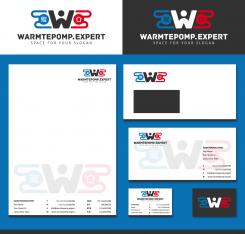
- Would you be able to change the big 'W' into the 'expert figure'. Now I believe the logo get's too bulky when it is added on top. Would you be able to also create a sample for the house style (Word/Powerpoint template)? Kind regards, Bart
Oh... and forgot the '-' between warmtepomp and expert need to be changed to a '.' as this is our web address. Thanks
No comments
Thanks for submitting this design. We really like it. Would it be possible to slot in a 'person' figure somewhere? Depicting the 'expert' in our name (f.e. on the 'o')? See this suggestion: http://www.businesscoot.com/img/expert_icon_large.png
 Nederland
 België
 France
 Deutschland
 Österreich
 United Kingdom
