No comments
DigitalMouse
- Contest holder: mcabaraux
- Category: Logo & stationery
- Status: Ended
Start date: 18-12-2012
Ending date: 18-01-2013
It all started with an idea...
A short, interactive guide helped them discover their design style and clearly captured what they needed.
Brandsupply is a platform where creative professionals and businesses collaborate on unique projects and designs.
Clients looking for a new logo or brand identity describe what they need. Designers can then participate in the project via Brandsupply by submitting one or more designs. In the end, the client chooses the design they like best.
Costs vary depending on the type of project — from €169 for a business or project name to €539 for a complete website. The client decides how much they want to pay for the entire project.
Ok, no problem. I did it. What do you say now?
Hi,
Ok thanks this is good now.
BRs,
Michaël
No comments
Hi,
Ok blue is ok now ...
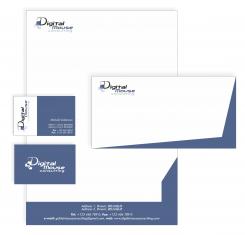
Could please put back the little "cubes" under the D of digital mouse ? And keep this blue then ?
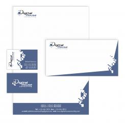
Little something extra for document template could you please keep the footer only with the blue and remove the blue on right side ?
Best Regards,
Michaël
No comments
Hi,
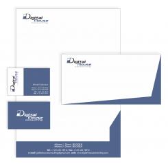
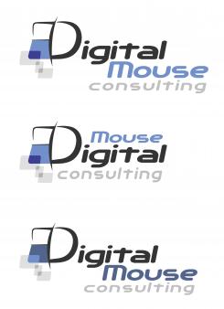
Sorry to come back on this again. But we think that another blue would be better. In the three first logo you have made we would like you to use the "blue" of the first logo (the top one of the three).
The rest is ok like that.
Best Regards,
Michaël
It's ok, don't apologise! Now I'm sending the newest solution. :)
No comments
Ok, I'm sorry, I didn't realised at first what you were talking about.
White blocks which I removed was something that reminds me a bit on some "digital things", and gray blocks which you can see on logo symbolise mouse clicking. Would you like me to keep it on logo or I should remove it also?
No comments
Hello,
Looks nice ...
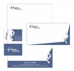
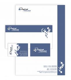
But as mentionned before the drawing (white blocks) looks a bit too much. We don't really know what they represent. Would it be possible to remove it and to keep the last colour scheme ?
BRs,
Michaël
No comments
Hi,
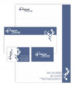
The logo is nice but I have small issue with the templates (business cards, ...). The drawing on the side is a bit strange.
Best Regards,
Michaël
Hello!
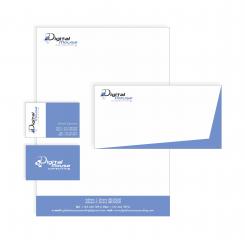
Do you think about the back side of the business card? If you are, that is ok. If I use logo on a blue surface, colours of the logo should be a bit different. If you would like, I can fix it and made logo in negative on the other side of the business card and on the envelopes also.
You can also tell me, what hue of the blue I should use, lighter or darker blue? Which one do you prefer?
I would say back side in negative yes. For the blue the darker one.
Brs,
Michaël
Hello again!
I made some corrections on my negative logo. Hope you will like it.
 Nederland
 België
 France
 Deutschland
 Österreich
 United Kingdom
