Another version of blue on the letters.
Fresh, stylish & reliable logo and corporate design for a general practice in Maastricht, NL
- Contest holder: marjolijnprins
- Category: Logo & stationery
- Status: Ended
Start date: 08-05-2013
Ending date: 22-05-2013
It all started with an idea...
A short, interactive guide helped them discover their design style and clearly captured what they needed.
Brandsupply is a platform where creative professionals and businesses collaborate on unique projects and designs.
Clients looking for a new logo or brand identity describe what they need. Designers can then participate in the project via Brandsupply by submitting one or more designs. In the end, the client chooses the design they like best.
Costs vary depending on the type of project — from €169 for a business or project name to €539 for a complete website. The client decides how much they want to pay for the entire project.
Hi! here is another version based on what you ask concerning colors and layout.
Do not hesitate in contacting me in case of another question or request.
Finally, this is an orange version of the same logo which is a bit more energetic and vibrant.
Thanks again for your designs, it's good for us to see the different options. We prefer the colours to be limegreen and clear blue, is it possible to make the bubble all limegreen? Concerning the text, we like your suggestion to mark the word "heer" by using a different colour. We would like different colours of blue for the name of our practice. Concerning the lay-out: we like the word "huisartsenpraktijk" to be placed to the right as in the orange version. The position of the bubble above the word "heer" also has our preference.
Is it possible for you to do some last finetuning before our contest ends tonight? We are not sure how to keep in contact after the contest ends.
Thanks in advance
This option of colors is a bit more playful and lighter but within the colors you requested. I am also changing the layout of the words for you to see which options fit better the look you want.
As requested, here is a different color palette. This option is a bit more serious but still clean and modern to reflect the young team.
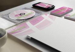
The stationary naturally would be immediately developed once a color palette and layout of the logo is decided.
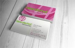
Logo and image applied to stationary
Thanks for your design, we appreciate the shape of the pink part with the big H in it and the font. We would however prefer another colour for the pink "bubble". Could you present some other colour combinations? A combination of fresh blue/green colours seems appropriate to us, but we are also interested in other ideas.
Thanks in advance, kind regards
Thank you for your feedback and score, I will work in a different color palette as requested to show you soon. Kind regards.
 Nederland
 België
 France
 Deutschland
 Österreich
 United Kingdom
