No comments
HOw much energy and fun can you add to a Logo?
- Contest holder: Florence Damen
- Category: Logo & stationery
- Status: Ended
- Files: File 1, File 2, File 3
Start date: 30-06-2017
Ending date: 07-07-2017
It all started with an idea...
A short, interactive guide helped them discover their design style and clearly captured what they needed.
Brandsupply is a platform where creative professionals and businesses collaborate on unique projects and designs.
Clients looking for a new logo or brand identity describe what they need. Designers can then participate in the project via Brandsupply by submitting one or more designs. In the end, the client chooses the design they like best.
Costs vary depending on the type of project — from €169 for a business or project name to €539 for a complete website. The client decides how much they want to pay for the entire project.
No comments
Dear Florence, In this proposal, the circle on F has more adapted to the design.
Greetings,
Milla Lekic
No comments
Dear Florence color combination od light-green/aqua/purple/red. What do you think about this?
Greetings,
Milla Lekic
No comments
Dear Florence, color combination is red/purpl with darker grey for Development and vitaliteit/coaching/advies. I think it is better slightly darker gray. Do you like this gray ?
Greetings,
Milla Lekic
No comments
Dear Florence, color combination is orange/red/purpl with darker grey for Development and vitaliteit/coaching/advies. What do you think about this ?
Greetings,
Milla Lekic
Dear Florence, thanks for your rating. If you choose my design, on stationery we can work through my e-mail mymyfamous@gmail.com And if you want, I can send you logo in more colors.
Greetings,
Milla Lekic
HI Milla, thanks! Can you make one more adjustment. Can you separate the F from the circles. So I have three circles and one F.
1.Either the F could follow the shape of the circles and stays under the three circles but ends in the middle of the word coaching (instead of going al the way down).
2. option is to separate the F from the three circles and the F is nog going round but just a line that moves like the other line in the F. I hope it is clear what I/m writing....I will choose soon between you and the other designer.... Gosh you are both so good!!!
No comments
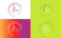
In this design I used only light green and darkgreen.
No comments
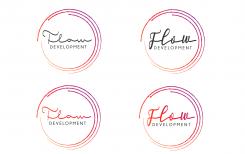
Dear Florence, In this design I used only red/purple. I changed that vitaliteit, coaching , advies be in the middle i use smaller letters than development. You can see that in one design vitaliteit, coaching , advies it is gray in another combination red/purple. What do you think of these proposals?
Greetings,
Milla Lekic
Lovely. I prefer letters of Development and vitaliteit/coaching/advies in grey. The position is better around the circles otherwise it is not readable on an invoice e.g because the logo will be smaller printed on the invoice/paper. Do you think the grey is readable when the logo i smaller. Or should the grey be slightly darker? I prefer red/purple more than green in this design. It is more powerful i guess. Can you make one design extra using the old colours orange/red /purple and using the letters in grey/ slightly darker grey just like in this design. That means i have two equal designs but slightly different colours....( red purple....or orange/red/purple)
No comments
Dear Florence, background is apple light green. The outer and inner circle darkgreen the vitaliteit / coaching/ training / advies in one proposal is white around the circkels in the second green undernetaht. I also worked on the letter F . Do you like like this?
Greetings,
Milla Lekic
Thanks. Good work. I think i'd rather stick to a white background.
Can you design the red/purple one also in green colours or green fading into others shades similar to green. And please leave away the word trainig. I prefer vitaliteit, coaching , advies. Could you make the size of the letters around smaller than in the word development. So thaht the focus is on Flow Development. And Please line out the words in a way i do not have to read the words upside down. Tomorrow i wil decide between you and one other....
No comments
Dear Florence,
I work on your suggestion, I created three circles, first one is letter F. And every other circle continues on the previous one. i hope you liked, and Of course if you have any suggestion feel free to write.
Greetings,
Milla Lekic
HI Milla, i understand the creativity of the letter F used in circles. But most people read a T instead of an F. Can you adjust this. I like the colours. Can you make a version with an adjusted F but still in the same look and feel. And a second one with a different font.
extra: i like to see three layers which give meaning to three levels of vitality ( physical/mental/emotional).
Is it possible to also design a second alternative logo based on version one but with more 'flow' in the letters Flow. Keep up the good work, i am enthusiastic!
I would also like to see an alternative colour: Background apple light green, the outer and inner circle darkgreen , the middle cirkel white. And the letters in white. Ik would also like to add the words vitaliteit / coaching/ training / advies undernetaht of around the circkels just to make sure that this is not associated with an IT company.
Dear Florence, thank you very much for your comments I started working on your suggestions.
Greetings,
Milla Lekic
No comments
i don not like the used fonts. I need a stronger and still smooth font.
No comments
Dear,
Thanks for you comment, do you have something like this on mind? If you have any suggestion feel free to write.
Greetings,
Milla Lekic
this font is too elegant and thin
this font is too elegant and thin
 Nederland
 België
 France
 Deutschland
 Österreich
 United Kingdom
