No comments
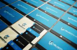
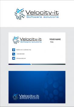
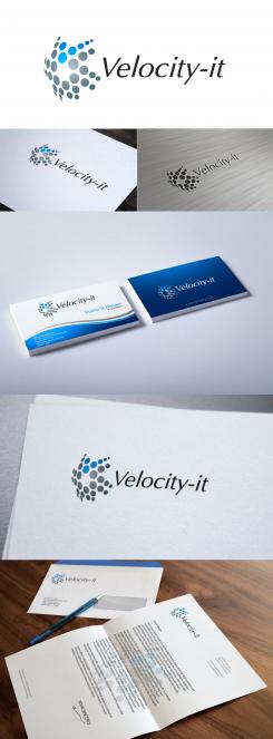
Intelligent, strak en pakkend logo + business card voor een dynamisch it-bedrijf
- Contest holder: Velocity
- Category: Logo & stationery
- Status: Ended
Start date: 09-05-2015
Ending date: 30-05-2015
It all started with an idea...
A short, interactive guide helped them discover their design style and clearly captured what they needed.
Brandsupply is a platform where creative professionals and businesses collaborate on unique projects and designs.
Clients looking for a new logo or brand identity describe what they need. Designers can then participate in the project via Brandsupply by submitting one or more designs. In the end, the client chooses the design they like best.
Costs vary depending on the type of project — from €169 for a business or project name to €539 for a complete website. The client decides how much they want to pay for the entire project.
No comments
You are quick :-). I like the shiny/glimmy part in the centre of the logo. I think that's enough. It's just a touch of it. In the business card however, the shiny/glimmy part is too much. I would like to have a business card where I can present myself clear but without showing off:
* IT
* Innovative
* Quality
* Bright/clever
P.S. I do not like the italic font. Please also put "Software solutions" in the logo.
No comments
No sorry, I like your first design better. With the logo on the left. I think this font makes it less professional. Too much blue and too fat. Can you try it again but with the other logo and with the quote "Software solutions". I think the logo says that we are a clever IT company and that we are innovative. The font should finish it by giving a feeling of quality and professionalism.
Can you also design the business card as it is part of the contest?
No comments
I like what you did with the logo, the word Velocity-it is not in harmony with the logo.
 Nederland
 België
 France
 Deutschland
 Österreich
 United Kingdom
