No comments
Logo and corporate identity for new company modern and appealing
- Contest holder: Dushi Yiu
- Category: Logo & stationery
- Status: Ended
- Files: File 1, File 2
Start date: 15-11-2019
Ending date: 20-11-2019
It all started with an idea...
A short, interactive guide helped them discover their design style and clearly captured what they needed.
Brandsupply is a platform where creative professionals and businesses collaborate on unique projects and designs.
Clients looking for a new logo or brand identity describe what they need. Designers can then participate in the project via Brandsupply by submitting one or more designs. In the end, the client chooses the design they like best.
Costs vary depending on the type of project — from €169 for a business or project name to €539 for a complete website. The client decides how much they want to pay for the entire project.
Hi,
I make th adjustments that you want.
Let me know if I can be more helpful.
Regards,
Krisi
Excellent Krisi! Am I able to adjust telephonenumber, e-mail, etc myself if you have send them to me after this contest?
You can... If you have Adobe Illustrator program... but don't worry about that, even after the contest I will give you my personal e-mail and I can adjust everything for you.
Perfect!
No comments
Hi,
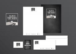
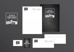
here my idea for your corporate identity.
Let me know what do you think and of course if you want to adjusted.
Regards,
Krisi
Thanks Krisi!
Like the black business card. Could you fit in the symbols of a mobile phone, e-mail and LinkedIn. I don't have an own website yet.
And could you put the logo in the writing paper on top (in middle) and the companyinformation on the bottom.
No comments
Hi,
I make it with pattern that you upload.
What do you think?
Regards,
Krisi
You are great Krisi! Really looking forward to the corporate style...
Thank you! :)
I will work on it.
No comments
Hello,
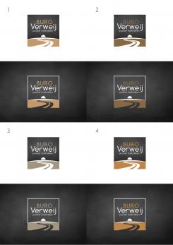
I make you 4 color versions... if you want you can also show me the color that you seek.
I think it should be neutral and not so dark color so it'll be enaugh visible on dark background.
Regards,
Krisi
#3 is close to favorite! I will add an example of concrete-look. Wonder if that will match with the blackboard black.
No comments
Hello,
I make for you 4 examples with different font style and I change colors.
Let me know if I can be more helpful.
Regards,
Krisi
Thanks Krisi! #3 is favourite qua font style. Blackboard black is just perfect!
I see you have changed the gold colour is something more soft. Somehow I am still doubting about that colour. What do you think will fit in the logo?
No comments
Hello,
here my new proposal for your logo.
Let me know what do you think.
Kind Regards,
Krisi
Really nice Krisi! You really seem to understand my expectations (as well in your first design as in your second). It's also really compact.
Some suggestions:
- change black in 'blackboard-black' (see example #2)
- one or two alternative fonts (to compare)
- change the gold colour in 'wood colour'
No comments
Origineel ontwerp Krisi! Gaaf hoe je het bureaublad in perspectief met het kader hebt gecombineerd. De onderste is mijn favoriet.
Kun je nog de volgende aanpassingen doen:
- zwart aanpassen in krijtzwart
- lettertype moderner (bv zoals andrelopes)
- iets meer detail in het bureau verwerken
De wens van het bureau wil ik bij nader inzien loslaten. Het beeld van een stip op de horizon wil ik daarvoor in de plaats gebruiken. Is het voor jou mogelijk om dat te verwerken ipv het bureau?
Thank yor feedback!
Could you please text your comment on English beacuse I am not sure I understand correctly.
Thank you in advnce,
Krisi
hi Krisi, of course:
I like your original design. The way you have put the desk in perspective with the outlines. I was wondering if you could change the black colour in black 'blackboard-black' and the characters in a more modern font.
I am doubting about the desk however because it will be too dominant maybe. What do you think?
As an alternative for the desk I was thinking about a winding road to the horizon. Look for examples in the files I have uploaded.
 Nederland
 België
 France
 Deutschland
 Österreich
 United Kingdom
