No comments
Logo and house style for the most innovative dental practice
- Contest holder: autoklaven-shop
- Category: Logo & stationery
- Status: Ended
Start date: 28-12-2020
Ending date: 08-02-2021
It all started with an idea...
A short, interactive guide helped them discover their design style and clearly captured what they needed.
Brandsupply is a platform where creative professionals and businesses collaborate on unique projects and designs.
Clients looking for a new logo or brand identity describe what they need. Designers can then participate in the project via Brandsupply by submitting one or more designs. In the end, the client chooses the design they like best.
Costs vary depending on the type of project — from €169 for a business or project name to €539 for a complete website. The client decides how much they want to pay for the entire project.
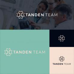
How about this pastel color, please comment about changing the logo or color, im ready to do that, thanks
These are teeth too, only contour cut, so they don't look like 100% teeth
collaboration new version, How about this?
Hi Excellent, we like this logo quite a bit! We wanted to ask if you could make it a bit more clear that the four shapes are teeth, and if you could experiment a bit with the colors :) Maybe present it with a light background as well? We will not use it on darker backgrounds.
of course, I will fulfill what you want, thank you, please wait,
regards!
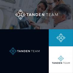
how about this change?
Hi excellent, we really like this one. We like the pastel-direction color-wise, but aren't completely happy with the color. Would you have the option to change the colors, and show the logo with a white background as well?
of course, I will fulfill what you want, thank you, please wait,
regards!
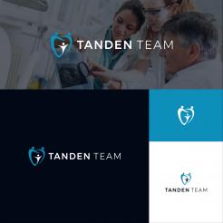
interdisciplinary collaboration, Please check, thanks
Hi Excellent, thank you for your design! It shows the collaborativeness, and I think it looks modern enough. We don't like having the circles as faces on top of teeth though, is that something you can change? Besides that, we would like the color scheme to be more soft to express protection and calmness. I hope you have the opportunity to make a redesign!
okay thanks for your comment, I will try to do what you expect, please wait, thank you
 Nederland
 België
 France
 Deutschland
 Österreich
 United Kingdom
