No comments
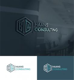
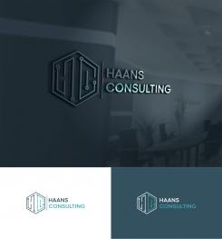
Logo corporate identity for software consulting firm
- Contest holder: JimmyH
- Category: Logo & stationery
- Status: Ended
- Files: File 1, File 2
Start date: 24-05-2021
Ending date: 28-05-2021
It all started with an idea...
A short, interactive guide helped them discover their design style and clearly captured what they needed.
Brandsupply is a platform where creative professionals and businesses collaborate on unique projects and designs.
Clients looking for a new logo or brand identity describe what they need. Designers can then participate in the project via Brandsupply by submitting one or more designs. In the end, the client chooses the design they like best.
Costs vary depending on the type of project — from €169 for a business or project name to €539 for a complete website. The client decides how much they want to pay for the entire project.
I think we have a winner ;) When I select you as the winner, what exactly will I receive from you?
You will have eps, png, pdf, ai, jpg files
Excellent!
Excellent!
No comments
Other left please ;)
sorry :)
No comments
check please :)
greetings joe ..
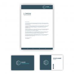
Looping good! 2 remarks, please remover the Line beteren the logo and 'Haans Consulting' on the backside of the business card and please move the logo in the header of the letter to the left side.
Looking good* and between the logo*
thank you :)
greetings joe hart.
No comments
check please.
greetings joe hart
Thanks for the quick turnaround!
You were right on the line weight of the logo, your initial design was better. I have some remarks on the documents:
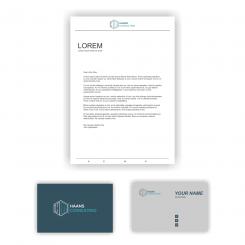
*can you please remove the line between the logo and the 'Haans Consulting' text.
*could you add a globe icon to the business card for my website
*could you make the background of the text side of the business card White
*on the text side of the business card, on the left side of the card, could you place the logo there without the 'Haans Consulting' text, in about the size of the logo on the backside.
*could you create sort of a header and footer on the letter, in the color of the backside of the business card, with the logo to the left side. Sort of like this (but with the logo to the left): https://studioboszkers.nl/wp-content/uploads/2017/04/Praktijk-Kramer-mock-up-logo-huisstijl-.jpg
Lol, the website bad a bit of a technical malfunction...
okay I will do it, please wait :)
greetings joe.
No comments
Nice!
Thank you .
greetings joe hart.
Hi Joe, I think I want to go with your logo design + colors. Could you show me some examples of the logo in some thicker line weights, I'm just wondering how that would look.
I was also expecting things like document templates, business cards and an email footer, is that something you would create next?
ok i will do it, please wait :)
 Nederland
 België
 France
 Deutschland
 Österreich
 United Kingdom


