No comments
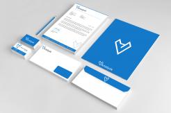
Logo with corporate id for international secondment company in data specialists
- Contest holder: Timesource
- Category: Logo & stationery
- Status: Ended
- Files: File 1
Start date: 08-01-2019
Ending date: 15-01-2019
It all started with an idea...
A short, interactive guide helped them discover their design style and clearly captured what they needed.
Brandsupply is a platform where creative professionals and businesses collaborate on unique projects and designs.
Clients looking for a new logo or brand identity describe what they need. Designers can then participate in the project via Brandsupply by submitting one or more designs. In the end, the client chooses the design they like best.
Costs vary depending on the type of project — from €169 for a business or project name to €539 for a complete website. The client decides how much they want to pay for the entire project.
Hi Tom,
I work on the second proposal for CI. Also if you have any suggestion feel free to write.
Greetings,
Milla and Sasa
No comments
Hi Tom,
Thank you for positive feedback I'm glad you like design, this is my first proposal for CI what you think? If you have any suggestion feel free to write.
Greetings,
Milla and Sasa
No comments
HI Tom,
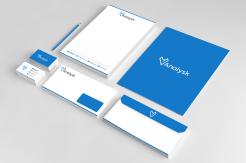
I use Axiforma font also Ana letter is little closer and make space between Ana lysk. Also i will present stationery whit this design and font. If you have any suggestion feel free to write.
Milla
Hi Milla, Thanks for the adjustments. The design is excellent like this. Look forward to the rest of the cid. Greetings Tim
Hi Tim,
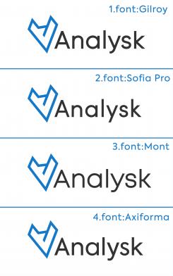
Thank you for comment you help so much to this design be perfect :). i use all for fonts you sent me and present how look whit logo icon. also if you wont i can cut horizontal line on letter A? Also if you have any suggestion feel free to write. When you chose font i can work on corporate identity. If you have any suggestion feel free to write.
Greetings,
Milla and Sasa
Thx for the fast response. I think Axiforma is the best font so please use that font for the cid. You're right about the fact that the name Analysk needs a little touch. What i am thinking about is to make a slight adjustment in the spacing between the letters. Let's try something: Can you put the "Ana" letters just a little closer to each other and ad a little more space between the Ana and "lysk"? This subtle detail makes the logoname unique and puts the accent of the name in the right place. Besides this you can make a small adjustment in the capital A, like removing the horizontal line in the A a part of this line, like in your previous design. I'll leave this up to your creativity ;)
Thx for the fast response. I think Axiforma is the best font so please use that font for the cid. You're right about the fact that the name Analysk needs a little touch. What i am thinking about is to make a slight adjustment in the spacing between the letters. Let's try something: Can you put the "Ana" letters just a little closer to each other and ad a little more space between the Ana and "lysk"? This subtle detail makes the logoname unique and puts the accent of the name in the right place. Besides this you can make a small adjustment in the capital A, like removing the horizontal line in the A a part of this line, like in your previous design. I'll leave this up to your creativity ;)
No comments
Dear,
Thank you for comment i work on suggestion for design.
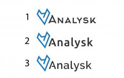
I think you have point for font, i use example of similar font from amazon, uber, M.stanley. i put 3 optinos for font, you can tell me what style you like more? Also I think number 2 look best on design :)
Hi, i think the logo-picture is fine now, but i'm not sure about the font yet. Indeed, no 2 is the better font but i think its not perfect yet. So I've looked to several fonts this weekend. The font's i liked most are sans serif type fonts. I prefer fonts like Gilroy, Sofia Pro, Mont, Axiforma. Hope you can do the final logodesign with this information. :) Thx Regards Tim
Hi, i think the logo-picture is fine now, but i'm not sure about the font yet. Indeed, no 2 is the better font but i think its not perfect yet. So I've looked to several fonts this weekend. The font's i liked most are sans serif type fonts. I prefer fonts like Gilroy, Sofia Pro, Mont, Axiforma. Hope you can do the final logodesign with this information. :) Thx Regards Tim
No comments
Dear,
Thank you for excellent explanation :), I work on your suggestion what you think? also put icon on top right side. If you have any suggestion feel free to write.
Greetings,
MIlla and Sasa
Hello, you're welcome, its in my own interest :) I think the line in the middle (the nose) should be aligned with the left ear (so a fraction shorter) Plus maybe the font still is a bit to scifi. Maybe the font like the logo's of Morgan Stanley, Amazon or Uber would fit better? What do you think?
No comments
Dear this is my new proposal for logo design. and present growth diagram. What you think, if you have any suggestion feel free to write.
Greetings,
Sasa and Milla
No comments
Dear,
Thank you for comment and rating. I'm glad you like design. i work on blue color. what you think?
Greetings,
Sasa and Milla
I have a request for a few changes that, I think, will make your design much stronger. Let me explain: I have a smart dog at home and when he tries to understand me he tilts his head. A fox does the same with his head.
So please tilt the logo to the left and align it with the A. Maybe you need to change the form of the head a bit, or tilt the A, to make it in balance.
Furthermore i would like de design done with one line. So please remove the horizontal line of your design.
Please open this link: https://www.dropbox.com/s/bkvp7nchctg49eu/Analysk fox design request changes.jpg?dl=0
I think it will make more clear what i mean.
Looking forward to your adjusted design
Regards Tim
No comments
Dear,
Hope you like my idea for Fox and letter A if you have any suggestion feel free to write.
Also my idea for fox is most intelligence animal also powerful insight, analytics, strong.
If you have any suggestin feel free to write.
Greetings,
Thx for the design and the idea. I like it. Can you do some variations on this? Preferrably in blue colors. Thx! Regards Tim
 Nederland
 België
 France
 Deutschland
 Österreich
 United Kingdom
