No comments
New logo and housestyle required
- Contest holder: Fie79
- Category: Logo & stationery
- Status: Ended
- Files: File 1
Start date: 23-08-2019
Ending date: 26-09-2019
It all started with an idea...
A short, interactive guide helped them discover their design style and clearly captured what they needed.
Brandsupply is a platform where creative professionals and businesses collaborate on unique projects and designs.
Clients looking for a new logo or brand identity describe what they need. Designers can then participate in the project via Brandsupply by submitting one or more designs. In the end, the client chooses the design they like best.
Costs vary depending on the type of project — from €169 for a business or project name to €539 for a complete website. The client decides how much they want to pay for the entire project.
No comments
Hi,
Thank you for your detailed feedback :)
Do you want to say something like this?
I'm not sure if I understood your request
Let me know if you need more changes !
Kind reagrds,
Antoine
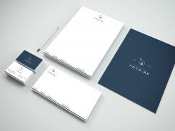
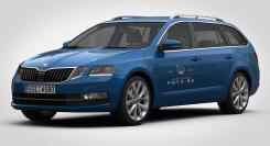
I tried to find a mockup with the skoda octavia without success.
So I took an image and embedded the logo on it, the rendering is not very optimized
KR,
Antoine
Good morning Antoine, no problem, it still gives a good visual.
I was wondering if it would be possible to make a few variations to the designs.
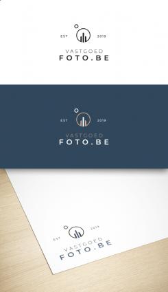
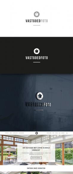
The est 2019 can be removed, it looks nice but we will not use it in our logo. Is it maybe possible to have one variation of the design with a very thin line around the logo (resembling the camera) where the bottom line starts at the V from Vastgoed and ends at the d from vastgoeD. The word foto.be can be outside the box. thanks and kind regards,
Sophie
No comments
Goeie avond Naelix, zou het mogelijk zijn het design iets aan te passen zodat de tekst foto iets grote is en vastgoed iets kleiner, anders is de nadruk op vastgoed te groot en we verkopen geen vastgoed maar doen veel met foto ;-)
heb je toevallig ook een voorbeeld van logo op auto, indien mogelijk zwarte skoda octavia break
alvast bedankt
graag in dat blauwe met wit/bruine logo of goudkleurige
Ok I'll do that for you, thanks for your feedback ! :)
No comments
feedback is always welcome :)
Mooi, maar eigenlijk te vanzelfsprekend en simpel, ik zoek iets strakker en minimalistischer.
 Nederland
 België
 France
 Deutschland
 Österreich
 United Kingdom
