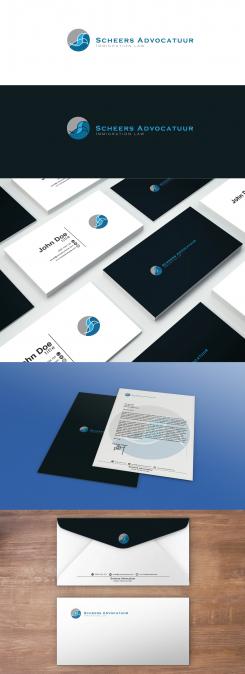
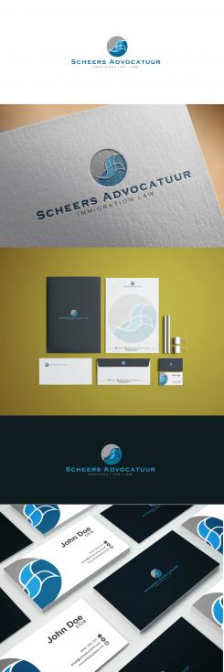
Here is changed stationary elements for you.
Edges of the birds do not look nice at all and spoil the whole impression and style if they are outside the circle.
Such work together sophisticated and harmonious in all presentations.
Hope is better now.
Regards,
Marko.
Wanted: logo for a new small law firm specialized in immigration law
- Contest holder: ErikS
- Category: Logo & stationery
- Status: Ended
Start date: 14-01-2017
Ending date: 28-01-2017
It all started with an idea...
A short, interactive guide helped them discover their design style and clearly captured what they needed.
Brandsupply is a platform where creative professionals and businesses collaborate on unique projects and designs.
Clients looking for a new logo or brand identity describe what they need. Designers can then participate in the project via Brandsupply by submitting one or more designs. In the end, the client chooses the design they like best.
Costs vary depending on the type of project — from €169 for a business or project name to €539 for a complete website. The client decides how much they want to pay for the entire project.
Dear Erik,
one wing I changed and now looks more like letter "S".
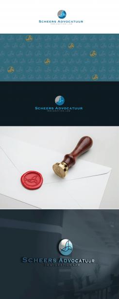
Here is a stationary, too.
Stylish, but simple and professional.
Hope that you like it.
Regards,
m3kdesign
www.m3kdesign.wixsite.com/portfolio
Looks great, however, I would like to see how it looks when the logo is not above but on the left side of my companies name. At the business card I like the logo to be smaller and I'm wondering how it looks like if the end of the wings fall outside the circle.
Thank you for information and rating.
There is a preview using of logo.
Can I prepare stationary preview for you now?
Creative regards,
m3kdesign
Hi M3K, Can you also show me more in detail how this logo looks at printing paper (first page with address and other information below and follow pages with just the logo), a writing pad, envelopes and business cards?
Of course!
Another idea: is it possible to change the wing above a bit, whereby the wings also looks like the letter S (from Scheers)? I like the image of a bird, this shouldn't change.
 Nederland
 België
 France
 Deutschland
 Österreich
 United Kingdom
