Hi Hans Lange,
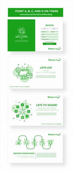
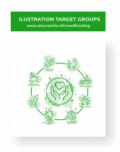
According to the research I have studied, the current trend of websites is to use unique illustrations, but everyone who opens the website still understands, even from all ages.
Let's make the website "www.steunactie.nl" into a simple, cool, and elegant website.
what about our designs? please give me feedback :)
Thanks
Best Regards,
Mayesha
It all started with an idea...
A short, interactive guide helped them discover their design style and clearly captured what they needed.
Brandsupply is a platform where creative professionals and businesses collaborate on unique projects and designs.
Clients looking for a new logo or brand identity describe what they need. Designers can then participate in the project via Brandsupply by submitting one or more designs. In the end, the client chooses the design they like best.
Costs vary depending on the type of project — from €169 for a business or project name to €539 for a complete website. The client decides how much they want to pay for the entire project.
Hallo Mayesha, we like the designs. We will get back to you after the competition is closed and if we pick you as winner we will need to have some adjustments made. But the style is good and what we are looking for.
Hi Hans Lange,
thank you for your feedback. I hope to be a part of the SteunActie team to help in helping the world to be better.
Kind Regards,
Mayesha
Hallo Mayesha, dit you receive my email from this past wednesday? We have not heard from you since.
No comments
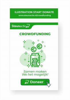
I use the bottle illustration because in donating you don't only receive big money, but also receive small amounts of money. This bottle-shaped illustration has the meaning of equality, regardless of rich or poor, young or old, etc
 Nederland
 België
 France
 Deutschland
 Österreich
 United Kingdom


