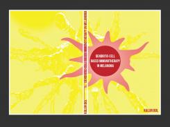
Hello, here is another option (to make the "top cell" more flat (although as I am not biologist, I can't really decide on the form and color, maybe you have some preferences?)
Start date: 03-05-2016
Ending date: 17-05-2016
It all started with an idea...
A short, interactive guide helped them discover their design style and clearly captured what they needed.
Brandsupply is a platform where creative professionals and businesses collaborate on unique projects and designs.
Clients looking for a new logo or brand identity describe what they need. Designers can then participate in the project via Brandsupply by submitting one or more designs. In the end, the client chooses the design they like best.
Costs vary depending on the type of project — from €169 for a business or project name to €539 for a complete website. The client decides how much they want to pay for the entire project.
the dark color is just the back-ground to see the edges of the cover, not part of the design
we can also edit the sizes and proportions of text and figures closer to the previous draft.
so what suggestions/comments would you have?
so what suggestions/comments would you have?
Hello,
here is my 'quite abstract' offer for you cover of your thesis (if you don't like it, I can offer a totally graphic approach also). Please consider, that this is a pitch (you like the sketches or not), so it is not quite finished :)
Hi Vents,
I like the way the "picture" partly falls on the back page and the subtle image in yellow. Also nothing wrong with the shape of the dendritic cell. Overall: nice first draft! What I don't like to much are the color and the lines in the red dendritic cell, I don't know exactly but it looks a bit dirty/desintegrating... Best
 Nederland
 België
 France
 Deutschland
 Österreich
 United Kingdom


