 Nederland
 België
 France
 Deutschland
 Österreich
 United Kingdom
Hi,
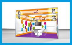
This is de exhibition stand with the logo and website address on separate locations. Also, in the original design only 2 types of Basti's were used. We've added 2 extra Basti's in this design. Your comments are welcome!
Kind regards,
Hein
Start date: 12-09-2013
Ending date: 08-10-2013
Total budget: € 349.00
WINNER
It all started with an idea...
A short, interactive guide helped them discover their design style and clearly captured what they needed.
Brandsupply is a platform where creative professionals and businesses collaborate on unique projects and designs.
Clients looking for a new logo or brand identity describe what they need. Designers can then participate in the project via Brandsupply by submitting one or more designs. In the end, the client chooses the design they like best.
Costs vary depending on the type of project — from €169 for a business or project name to €539 for a complete website. The client decides how much they want to pay for the entire project.
Designer:
 h.geenen
This contest is finished. Its not possible to reply anymore.

Dear sir,
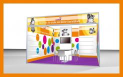
We've put in your website address and we've made the logo bigger. The green looks really fresh and clean, but of course we understand that you wish to keep it all orange. If there is anything we need to change, do not hesitate to contact us,
Best regards
Hein Geenen
2014
This contest is finished. Its not possible to reply anymore.
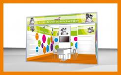
and a design in green...
Green is very, really very nice, but we will definitely not work with green at this moment - also not for the catalog and packing
This contest is finished. Its not possible to reply anymore.
Dear Sir,
We've adjusted the panels for the stand as requested. We've also tried to put in the shelves and the column. Your comment is again very welcome!
best regards
Hein Geenen
I am missing the website - and the logo needs an own spot as it is too smal
This contest is finished. Its not possible to reply anymore.
Dear Sir,
Herewith you will find our first design for the stand. Every panel will of course be delivered to you in the requested formats. We also made designs for your corporate identity, and a packaging header. Catalogue will follow later. We will upload them at the other contests...
Your comment is very welcome,
Best regards
Hein Geenen
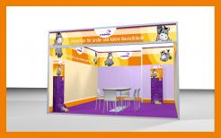
Thank you for that great propose. So far my feedback. What I like of your Design:
- Actually it is really nice even though I have nothing special to point-out
What I don’t like:
- That the plain-white circle for the logo
- That you have used the wrong Illustration ( I miss my table with the column in the middle, I miss the TV on the column and the boards for the craft-projects.)
Dear sir,
Thanks for you comments, we'll work with that. Do you have another image of the stand with the tv and the column in the middle with appr. the same view as the picture we used now? We'd like to hear from you,
best regards
H. Geenen
This contest is finished. Its not possible to reply anymore.