 Nederland
 België
 France
 Deutschland
 Österreich
 United Kingdom
Hi,
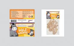
This is the packaging design with icons on the back instead of the descriptions in all languages. If you have any comments on this version, please let me know.
Kind regards,
Hein
Start date: 12-09-2013
Ending date: 08-10-2013
Total budget: € 349.00
WINNER
It all started with an idea...
A short, interactive guide helped them discover their design style and clearly captured what they needed.
Brandsupply is a platform where creative professionals and businesses collaborate on unique projects and designs.
Clients looking for a new logo or brand identity describe what they need. Designers can then participate in the project via Brandsupply by submitting one or more designs. In the end, the client chooses the design they like best.
Costs vary depending on the type of project — from €169 for a business or project name to €539 for a complete website. The client decides how much they want to pay for the entire project.
Designer:
 h.geenen
This contest is finished. Its not possible to reply anymore.
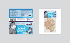
and a blue version,
Your comments are very welcome!
best regards
H. Geenen
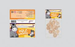
Nice but we stay with orange
This contest is finished. Its not possible to reply anymore.
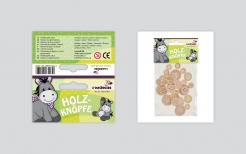
a version in green,
Nice but we stay with orange
This contest is finished. Its not possible to reply anymore.
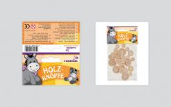
Dear Sir,
We've made the adjustments you've asked for in the package design. Also we made two extra versions in different colours. We've tried to shorten the information on the back of the package. The product number is now on the front. Maybe it is possible to use the icons for the information on the back (the same ones we used in the catalogue, what would you think of that? We'd like to hear from you,
Best regards
Hein Geenen
Very nice - I like this the most at the moment
2014
This contest is finished. Its not possible to reply anymore.
Dear Sir,
Herewith you will find our first design for the package header. Since you are very pleased with the original package design we've tried to maintain the most important elements and colours... We've added two languages on the back of the package. The other sizes we'll make when this one is okay for you. Your comment is very welcome,
Best regards
Hein Geenen
Thank you for that great propose. So far my feedback. What I like of your Design:
- The complete distribution of the front-side
- How you solve the problem of the different languages
- The barcode-position -> in your layout it's just perfect
What I don’t like:
- That we still keep writing x-times the same information (Stück, Pieces, Pieces, Piezas, Pezzi, and so on than Größe, Size, Tailles, Tamaño, Misure and so on)
- That the item number is on the backside – we need it on the frontside. When we are refilling the shelves it is good to see the item-number without turning the packing
- The purple is too squeaky
This contest is finished. Its not possible to reply anymore.