Catalog-Design, only certain pages
Contest details:
Gold
Needs:
We want to change that now. In a total of 4 contests we are looking for a designer that can manage this.
.
In this contest, is about of our catalog - especially important is the cover. Under www.i-mondi.com/download/Katalog.zip see our old files. The catalog 2013 you will find under http://www.i-mondi.com/index.php?s=97&lang=eng&
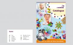
1. Cover
a. If a photo is required, please look only at Fotolia.de and share the number with us. We buy the images by ourselves.
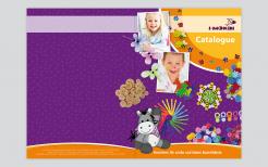
b. The cover can be designed graphically - it can be a combination of an image and a graphic - In any case, it must be interesting
c. It is important that the mascot (If you need a different position please tell us - you will find in the zip file all existing positions) appears on the cover
2. Table of Contents / Welcome Page
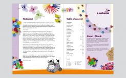
a. These two points should be distribute stylish and together on one page
b. The texts can be founded in the PDF-file in the zip
3. a product page
a. We are looking here for a template which previously defines things like:
i. How the background of the catalog pages should look like
ii. Where the logo should be placed per double page, where and how the category name should be placed
iii. How many items should appear per page
(7 product-images in the zip file for tryouts)
iv. Where the item description to appear
(example: foam rubber printed with hearts and glitter | assorted motives & colors | 50 pieces | Size: 35 mm, 25 mm)
v. Where to place packaging unit (for example 24/72)
vi: Icons for number or units, size, length, color, self-adhesive, weight, shape, diameter, thickness / thickness must be created and placed
vii. Barcodes (barcode example in the zip file)
4. Project page
a. Similar to a product page, we tried to find a template:
i. Where should we place the project (example project-page with associated articles can be found in the zip file
ii. Where should be the needed items been placed
iii. Which arrows should point to the required items
b. packaging page
i. This is about describing the packaging of i-mondi (examples in the zip file)
- Please deliver everything in inDesign with meaningful and labeled layers. If you linked graphics of Ilustrator and/or Photoshop, please also deliver them with meaningful and labeled layers.
- The texts are not to be converted in to paths.
- If you participate in this contest, you should ideally also participate on the other 3 contest of i-Mondi. It is important that your results matches together, if I've seen the catalog and than I get something else of the company i Mondi - I must IMMEDIATELY think "aaaaaaaah this is also of i-Mondi"
The other contest are about this:
1. Packing-Design
2. Corporate Design
3. Booth-Design
Company description:
Target group:
Colors, favourites and other requirements
h.geenen
-
-
Description by designer h.geenen:
Hi,
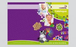
This is the cover of the catalogue in purple with orange. The other pages in purple will follow in the next 3 uploads. If you have any comments, please let me know.
Kind regards,
Hein -
This contest is finished. Its not possible to reply anymore.
-
-
-
Description by designer h.geenen:
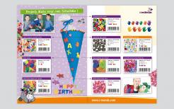
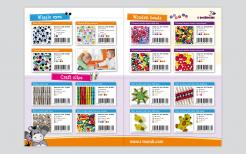
And a product page in purple.
-
This contest is finished. Its not possible to reply anymore.
-
-
-
Description by designer h.geenen:
The product page in purple
-
This contest is finished. Its not possible to reply anymore.
-
-
-
Description by designer h.geenen:
The pages with the table of contents and introduction in purple.
-
This contest is finished. Its not possible to reply anymore.
-
-
-
Description by designer h.geenen:
And a green version. We think maybe the green is a nice and bright alternative colour where the donkey stands out nice also...
best regards,
Hein Geenen -
h.geenen says
We're not sure wether you wish to change the orange to green, but of course we can chenge all the other designs to green as well.
-
iMondi says :
pppfffffffffff you guys are making my mind explote :-) this looks very great but green is a totally new element - as we don't want to change the packing color probably with stay we orange - but this looks amazing
-
This contest is finished. Its not possible to reply anymore.
-
-
-
Description by designer h.geenen:
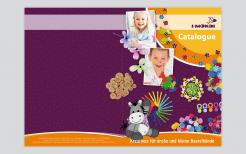
Herewith an alternative for the catalogue cover in orange and green, your comments are very welcome,
best regards
Hein Geenen
-
iMondi says :
Yeap probably this is the right for us
-
iMondi says :
2014
-
This contest is finished. Its not possible to reply anymore.
-
-
-
Description by designer h.geenen:
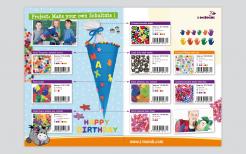
and (last) the projects page,your comments are very welcome!
best regards
H.Geenen -
iMondi says :
nice!
-
iMondi says :
2014
-
This contest is finished. Its not possible to reply anymore.
-
-
-
Description by designer h.geenen:
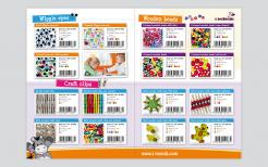
...products page,
-
iMondi says :
smart arrangement
-
iMondi says :
2014
-
This contest is finished. Its not possible to reply anymore.
-
-
-
Description by designer h.geenen:
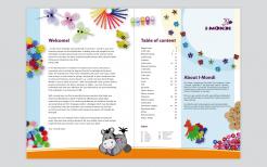
the introduction page and contents,
-
iMondi says :
Perfect very creative
-
iMondi says :
2014
-
This contest is finished. Its not possible to reply anymore.
-
-
-
Description by designer h.geenen:
Dear Sir,
We've just finished our first design for your catalogue. We chose to use fresh and bright colours next to the purple of your corporate identity. Photo material is all from fotalia as requested. If you have any questions about the designs you can call us at +31 (0)24 373 05 50 , we'll be happy to inform you further.
Best regards,
H. Geenen -
iMondi says :
the icons are a good solution - I liked the cover very much eventhough the blue was disturbing me - but after seeing it in purple and green I like those more :-)
-
This contest is finished. Its not possible to reply anymore.
-