Hello! Thank you very much for the rating and detailed comment!
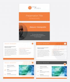
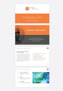
Here is my revised presentation. I made 4 different layouts for the inner slides.. Let’s see which of the options will works best for you. I’m open if you need to make any other improvements.
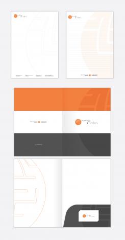
I also created designs for the letterhead, A4 blocnotes and A4 folder. Please, let me know what you think and don’t hesitate to ask me for revisions.
Looking forward to hear your next feedback.
I also wanted to ask you, if you're able to provide your logo as a vector file? If yes, it'll be much easier to work with it. Thanks!
Regards,
Dari
Design a professional graphic identity for a dynamic startup!
- Contest holder: WayFinders
- Category: Stationery design
- Status: Ended
Start date: 15-05-2019
Ending date: 31-05-2019
It all started with an idea...
A short, interactive guide helped them discover their design style and clearly captured what they needed.
Brandsupply is a platform where creative professionals and businesses collaborate on unique projects and designs.
Clients looking for a new logo or brand identity describe what they need. Designers can then participate in the project via Brandsupply by submitting one or more designs. In the end, the client chooses the design they like best.
Costs vary depending on the type of project — from €169 for a business or project name to €539 for a complete website. The client decides how much they want to pay for the entire project.
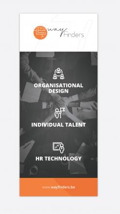
Hello! Here is my proposal for the banner. Please, let me know what you think and if you need to make any improvements.
Regards,
Dari
Hi Darina, I like your proposals! I'll discuss this with my colleague and give you more feedback later!
Hello! Here is my first proposal for your presentation layout.
Please, let me know what you think and if it is on the right direction. I’m open to make revisions or new options.
Also, please let me know what exactly you need to be created as part of this project? Do you need Letterhead and business cards? I saw that you need a banner.. Could you please share a bit more info about it? What would be the size, is there any specific requirements about the text/photos used on the banner?
All your comments and thoughts are welcome.
Regards,
Dari
Hello Darina! Thank you for your proposal!
We like the style and the title slide with orange & grey! In the last slide, we also like the icons!
Could you try something else with the logo? (eg watermark). We would also like some more colours in the slides (eg at the top or bottom).
Banner: 85 x 200. We have 3 pillars defined:
1. Organisational Design
2. Individual Talent
3. HR Technology
We would like to make these 3 pillars visual on the banner (names can still change).
Baselines we use: 'Find Your Rhythm', 'Talent Made Visible'.
You can use the logo, pictures, pictograms, we are open for all ideas!
Other things we would like:
- We already have business cards, so we don't need this.
- Letterhead: yes
- We want to have blocnotes (A4, Recto), also with a watermark of our logo.
- Folders/Map (like a map for A4 reports) (example: https://www.zwartopwit.be/shop/all/mappen-fardes/voor-a4-documenten).
Thank you! Looking forward to your proposal!
 Nederland
 België
 France
 Deutschland
 Österreich
 United Kingdom


